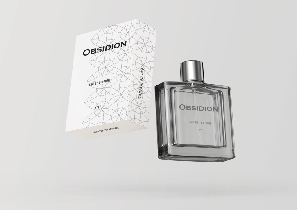
Obsidion Cologne. A fictional cologne brand I came up with and designed an image to be used as a full page advertisement in a magazine.
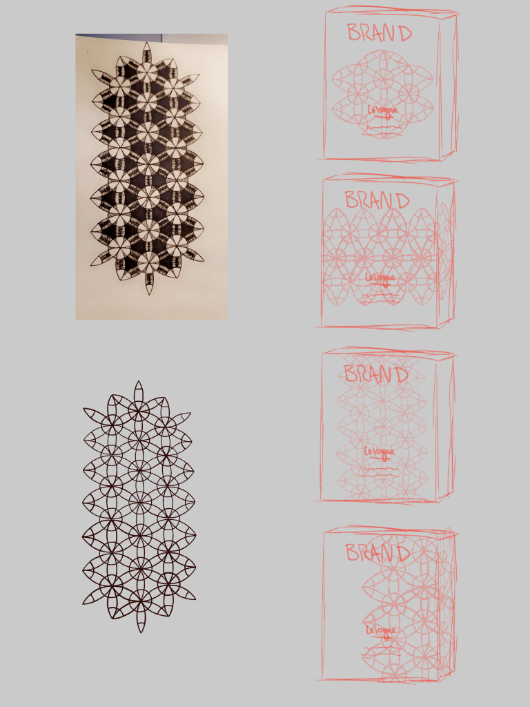
The sketches phase of my cologne ad. I took a geometric design I had made previously and came up with different ways it might be applied to a niche product brand.
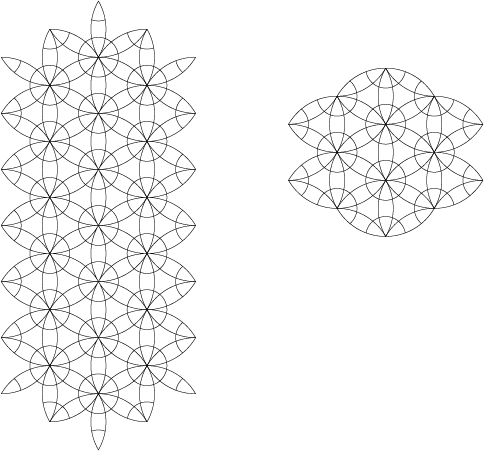
The clean line art of the geometric design, built in Adobe Illustrator.
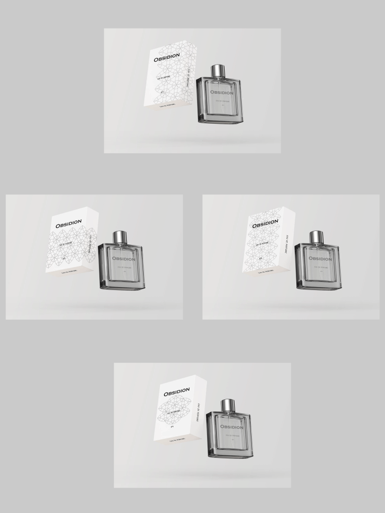
All 4 variations of the cologne product design. The design at the top ended up being the final one used in the magazine page mock up.
A passion of mine has always been books, so of course I had to do at least one book cover redesign.
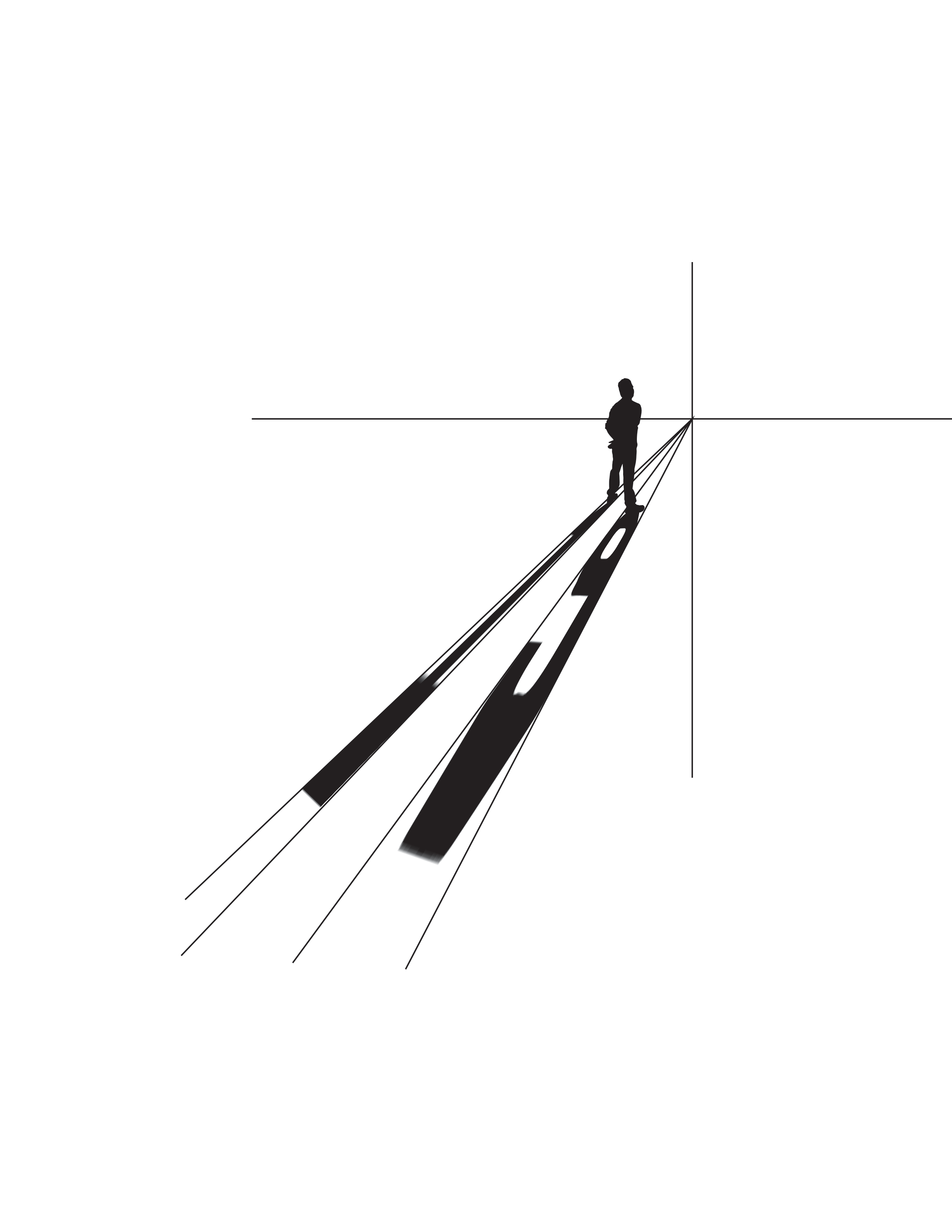
The first step to the new design was to take a picture of a man (aka my father) and convert it to black and white.
Then to connect it to the story, I used the jersey number of the main character as a shadow.
Add some color, text and flourishes and you get the final piece, ready to be adapted to a mock up.
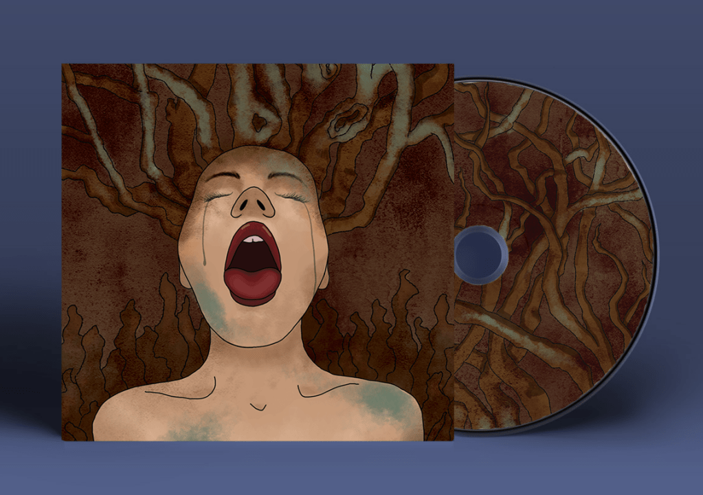
I am a fan of Nirvana, and the song In Bloom always got my imagination running, so I created a special edition cd cover that converts into a poster.
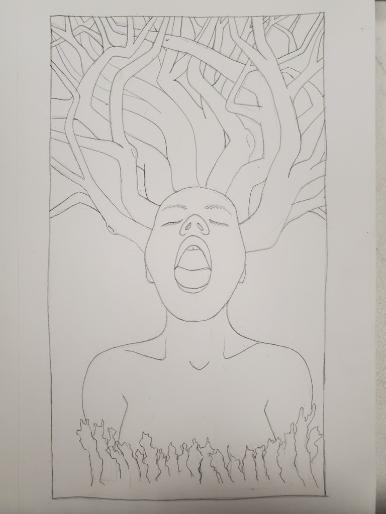
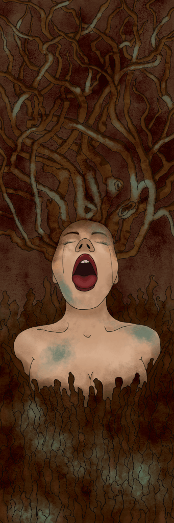
This was the original sketch I created, which I then uploaded and traced on Photoshop. This image was inspired by the line “nature is a whore” in the song In Bloom.
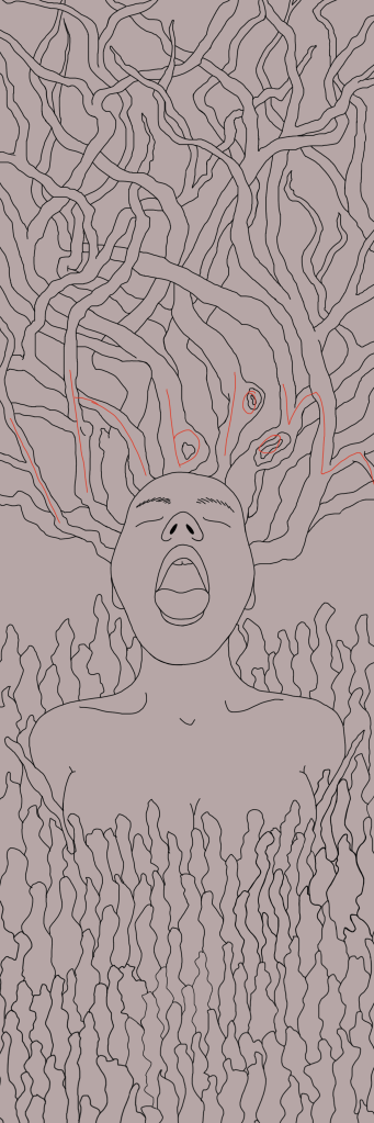
Once the sketch was traced, I added some extra illustration on the top and bottom to reach the proper size for the fold-up poster.
After adding color and details, this is what the poster would look like unfolded out of the cd case.
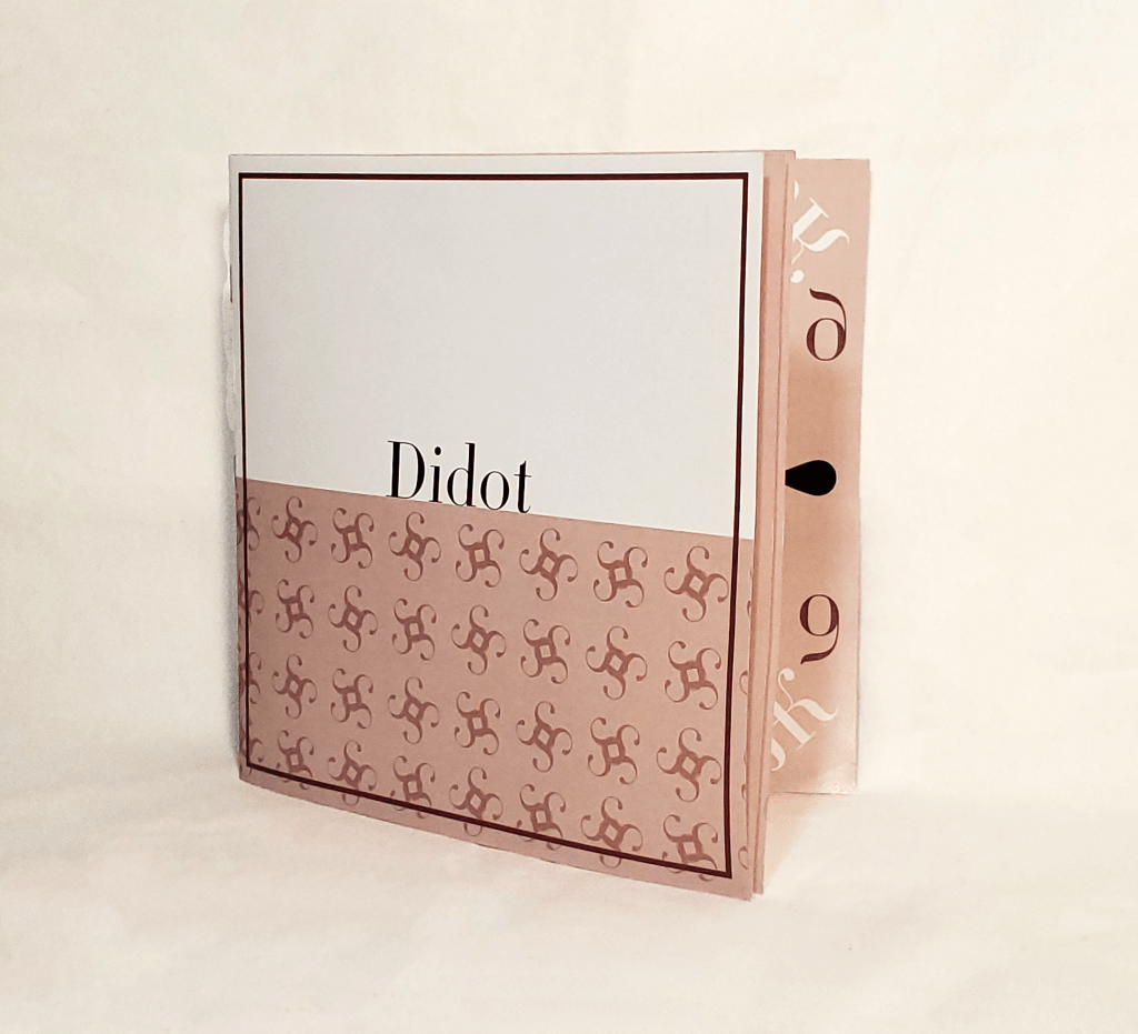
The constructed copy of my Didot type book
To start, I chose a typeface that I liked the aesthetic of that I could do some research on.
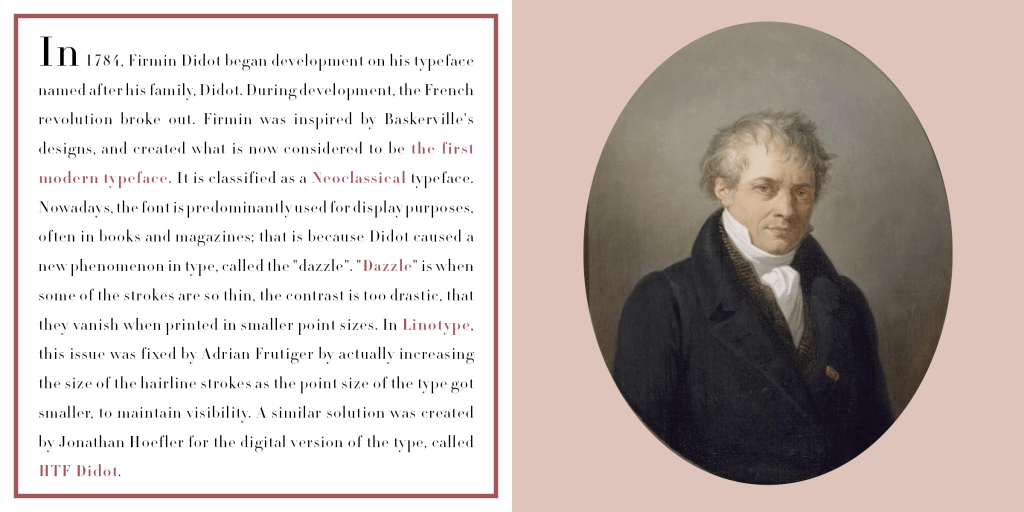
Then I discovered the rich history of the Didot typeface, created by Firmin Didot in 1784
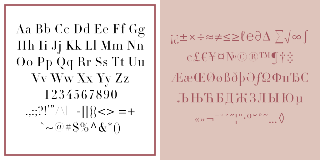
To display the beautiful attributes of the typeface, I created these pages of common characters as well as special characters.
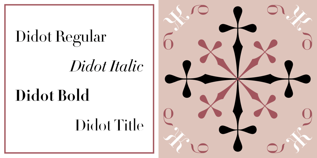
These are all four types in the Didot family, used for different purposes when using this font. I created the designs by using special characters in the Didot font.
This page explains the attributes of the Didot font, how it differs from other typefaces and how certain letters differ from each other.
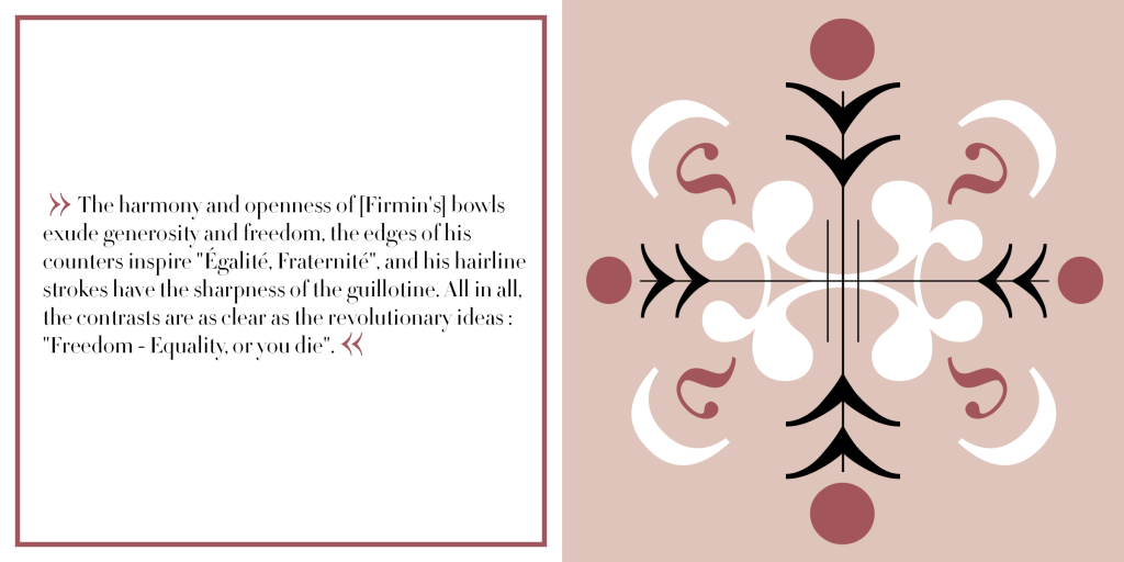
This font was created in 1784 around the time of one of the French revolutions, as such I chose a quote to emphasize the connection between creativity and history.
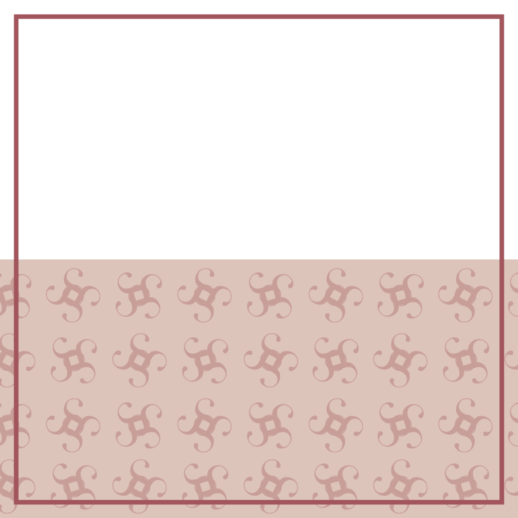
I created the back cover to mirror the front, the pattern repeated nearly perfectly for a seamless look. I also chose this color because it conveyed the subtle richness of the font itself.
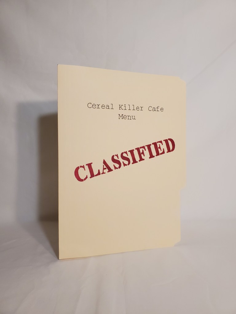
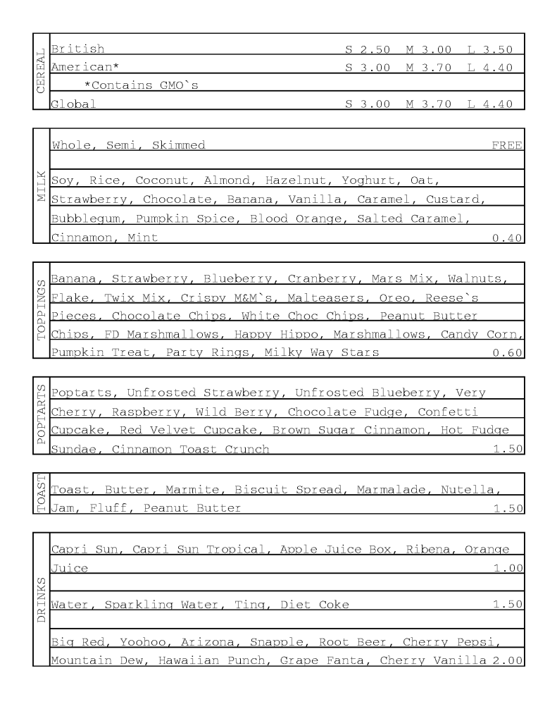
I redesigned the Cereal Killer Cafe menu to look like a classified file to play on the pun.
In addition to the menu cover looking like a classified file, the inside needed to match. So I used the old style typewriter font and set the boxes up to look like a old time police report
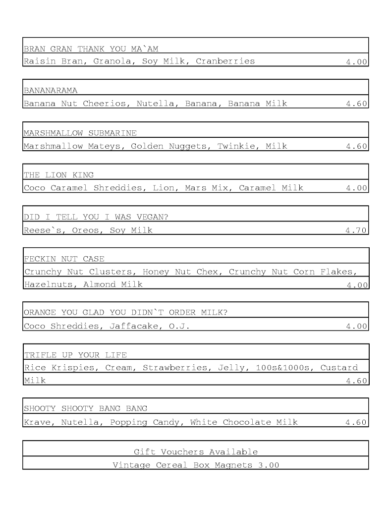
Cocktails are the specialty at Cereal Killer Cafe, so of course it needed it’s own flourish at the top to emphasize.